The Reaper & the Flowers

October 2021 - November 2021

School assignment for Professor Hayelin Choi

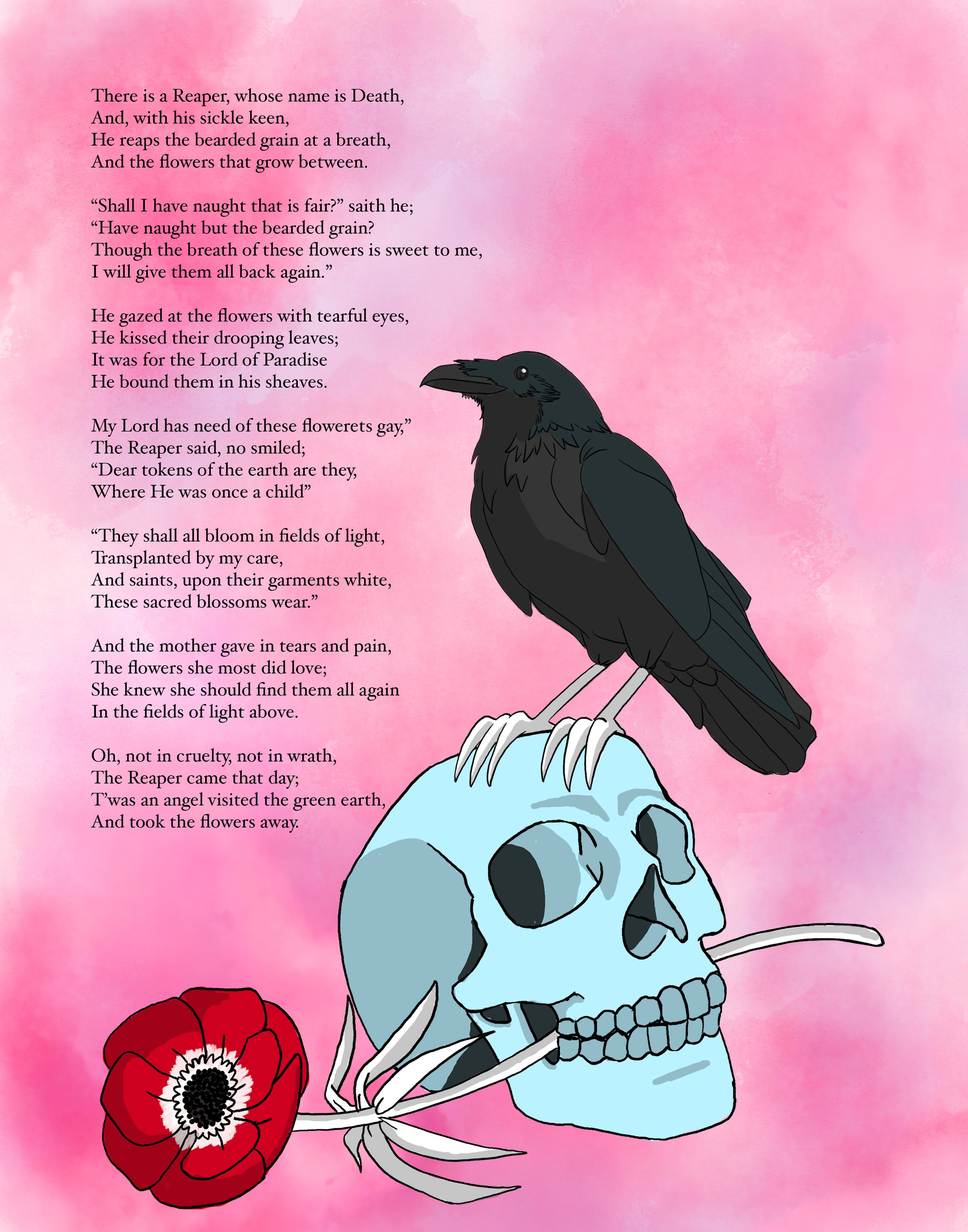
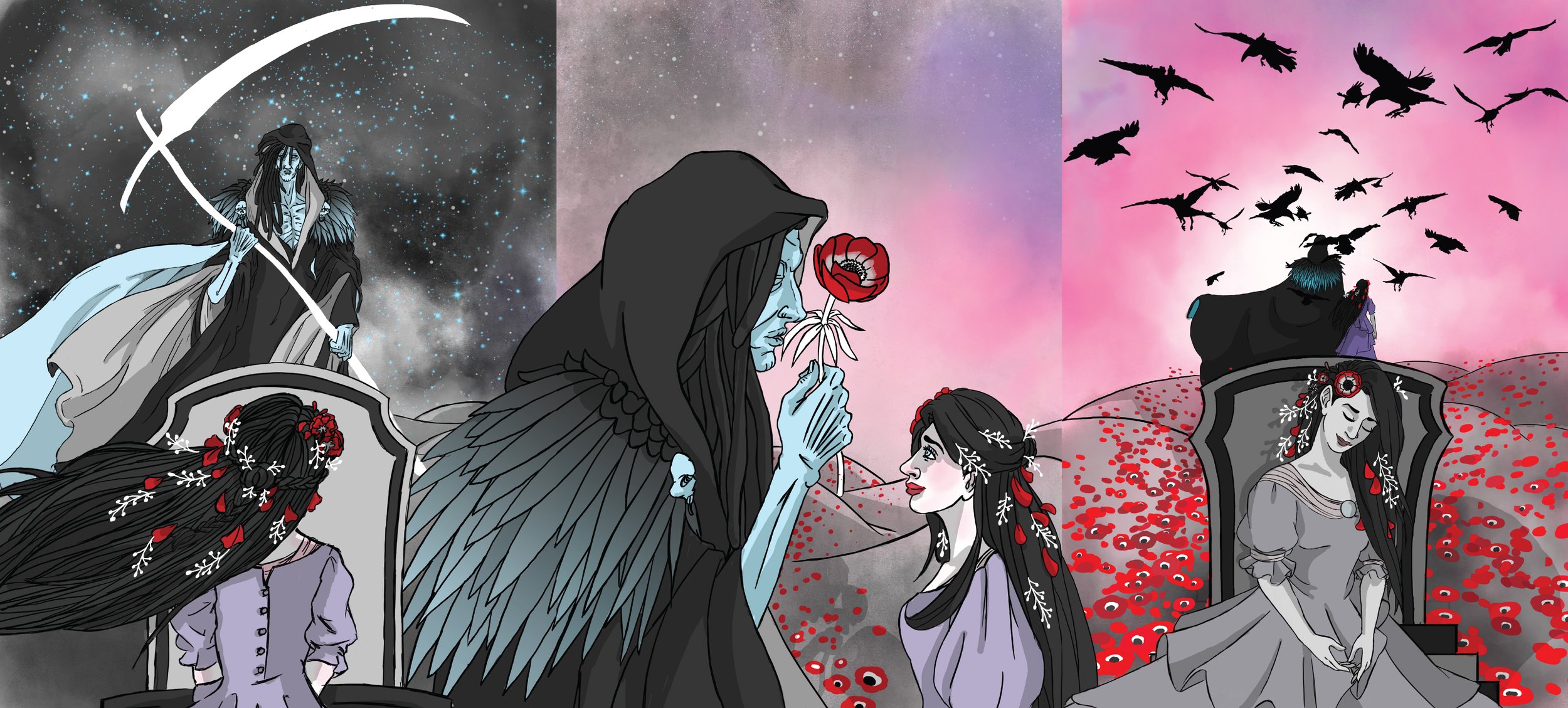
For this project, my class had to illustrate a poem in the form of a triptych. There were requirements we had to abide by including: having a limited color palette, it had to be a poem, and we needed to put together a moodboard. I chose a poem by Henry Wadsworth Longfellow and it is called The Reaper and the Flowers. It paints this image of Death coming for a woman at the end of her life. I chose this poem because I was fascinated by the portrayal of Death in any media, and they are not necessarily evil nor are they good. They just bring the souls to the afterlife and this poem did a good job by humanizing this inevitable force in a way that understands the transition of death.

Process

I started by creating a mood board and collecting images that reflected the visuals, colors and figures I wanted to feature in this triptych. It was from these images that I also found my color palette by using two shades of gray and a light shade of blue. Then the lavender, pink, and true red came from the anemone flowers.

Meet the Reaper

I knew I wanted to portray the reaper instead of the angel of death. The difference is that the reaper is commonly portrayed as a skeleton clothed in a black hood and robes carrying a harvest scythe. I wanted to keep those elements, but not draw him as a skeleton. I wanted him to look as if he is always on the verge of dying, but he never is. That is why I chose to make his skin this pale blue with no warm tones to make him feel cold and sickly.

Alternate Covers

Meet the Mother

With the character of the mother, I began to take liberties with the portrayal. Rather than her being a grown adult, I thought it would be more meaningful if she was a young woman at the grave of her mother. Wears her mother’s favorite flowers in her hair. I had to keep a limited color palette for the illustrations and I reserved the lavender and rose shades for the young woman as it would give a sense of life, but they are also not as vibrant to foreshadow that it is her time.

Initial Text Placement

There were challenges where I had to resize the characters so they were seen in different perspectives. However, the biggest challenge was trying to place the poem itself in the illustration. I initially took apart the poem and placed them throughout the illustrations. However, I chose to keep the poem as one page so it can be read on its own. My professor and classmates agreed that it was better. That way they could appreciate the illustrations as they are without seeing text in awkward places.

Final Print

Previous
Previous

Trade U: product design, research, onboarding and user profile design

Next
Next

Thirty Pieces of Me: iconography self-portrait